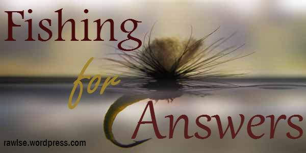
Sometimes an author has questions to ask, and the best people to answer those questions are You! Fishing for Answers is where a question is asked and then we debate about the answer in the comments below. We look forward to hearing your advice, tips or thoughts!
Question: For the body text of a printed Fantasy or YA book, what is your favorite font?
There are so many fonts out there, but only a handful are beautiful, clean, and easy to read on the printed page. We want to know, what is your favorite font to read in? What are most traditional publishers using for their books?
Give us your opinion in the comments. Let’s discuss!
~~~
Do you have a question you would like asked on Fishing for Answers? Place it in the comments below. For more writing talk and book world fun, join the free mailing list and follow the blog. Also find E. E. Rawls on Facebook, Tumblr, Google+, andTwitter. 🙂
~

I use Palatino Linotype. It’s clean and pretty while also being a generally accepted font for publishing. Other common choices are Garamond and Georgia. I hope that’s helpful!
LikeLiked by 2 people
I’ve seen some printed books use Palatino Linotype. I know I like writing in Word with it. 🙂 Can you name any books that use Garamond or Georgia? I’m not sure if I’ve come across those in body text.
LikeLiked by 1 person
This are mainly in ebook. There is another common print font or two, but I can’t recall what they are. It was over a year ago that I did that research. Hmm. Will have to go looking again. 🙂
LikeLiked by 1 person
Ikr? I had looked into some of it over a year ago, and now forgot, haha. We need to do some research digging! 😀
LikeLiked by 1 person
Yeah. Haha just to keep up on the latest info and developments.
LikeLiked by 1 person
I just found this article on 5 favorite fonts: http://www.thebookdesigner.com/2009/08/5-favorite-fonts/
LikeLiked by 1 person
Nice! The Book Designer is a respected source, too. 🙂
LikeLiked by 1 person
Agreed! 🙂 Are there any on the list you’d consider using, one day?
LikeLike
I sometimes employ Garamond, but I am partial to Palatino Linotype. I believe all of them on the lists are considers in the sans serif font family, but don’t quote me on that. haha I like the name “Bembo” but the spacing is a little wider than necessary, so probably Janson is the only other I’d be likely to choose. It’s spaced well and not too big or too small. 🙂 You?
LikeLike
I like Palentino Linotype a LOT as well. 🙂
LikeLiked by 2 people
Me too. 🙂 I’m curious what most traditionally published books out there are using?
LikeLike
They all look similar, but all have different names. Sometimes its on the back page of a paper book. I k.n.o.w. I’ve seen it there, but I just pulled a half-dozen books off my bookshelf and found none. Huh!
LikeLiked by 1 person
Hmmm, I will have to check the books I have now! Maybe it’s on the copyright page?
LikeLiked by 1 person
I’ve never checked there. Hmm.
LikeLike
When I researched sending my first manuscript to an agent for traditional publishing in the UK, it was to be printed in Times New Roman. 🙂 This is what I use for the main body of the text in my self-published work as well.
LikeLiked by 2 people
I admit I forgot all about Times New Roman. That’s a good option. Thanks for your help, Gregory! 🙂
LikeLiked by 1 person
You’re welcome 🙂
LikeLiked by 1 person
I just found this article, btw: http://www.thebookdesigner.com/2009/08/5-favorite-fonts/
LikeLiked by 1 person
Awesome! I’ll go check that out 🙂
LikeLiked by 1 person
Just read the article and shared on Twitter. I’ve only ever looked at Garamond as an alternative, but it’s nice to know there are others out there. It wasn’t on the list, but I’ve also played around with New Courier, but wasn’t overly fond.
LikeLiked by 1 person
I wish the others on that list came free with Word, you know? At least we have Garamond though. Thanks for sharing the list! Hm, I don’t think I’ve tried New Courier before. I’ve tried High Tower and Century Gothic, but that was for poetry; not sure how they’d do for body text.
LikeLiked by 1 person
New Courier is kind of like typewriter font, but I’m so used to Times New Roman that I mainly use that for writing, but I have used some nicer fonts for my chapter headings. 🙂
LikeLiked by 1 person
Which are your favorite for chapter headings? My poem book didn’t have chapter headings, but I’ll need them later for my WIP.
LikeLiked by 1 person
In my novella I just used Times New Roman, but larger than the main text and with a basic underline border. This time, I’ve been playing around with Harrington for the chapter headings as I feel it’s in keeping with the theme of my current novel. I think, it’s a good idea to have a little fun and use whatever font you like for the headings, so long as it looks good in the finished article and especially in a paperback format. 🙂
LikeLiked by 1 person
I like the idea of fun with headings. (as long as it looks good in the end, like you said. 😉 ). I’d like to know how people add an image or decoration around their headings? It looks so pretty in paperbacks.
LikeLiked by 1 person
😀 This may sound strange, but I’m adding an image to the top of my chapter heading at the moment. I’ve got some artwork and on Word go on Insert and Picture and choose from my Docs, then add, resize etc. I’m hoping it will be up to Createspace’s standards for paperback. 🙂
LikeLiked by 1 person
That’s interesting. I’ve heard that images should be sized in programs like photoshop before placed in a document, but I’ve never actually tried it. Let me know how it turns out! Do you have to add the image to each chapter heading yourself, or does it automatically duplicate the image and put it on each heading? (like how you can format the style of your heading and it affects every heading in the doc. Does it place the image with every heading in the doc?)
LikeLiked by 1 person
🙂 I normally resize in photoshop, but right now, I’m just playing around and seeing what the image looks like and how to format that into the document. Once I figure out all the details, I’ll probably do a post about how I did it and certainly let you know how it all turned out! I’m still working on fine tuning my headings and working a few ideas. It’s an ongoing process because with my next two novels I want them to be the best they can be! 😉
LikeLiked by 1 person
Sweet, I look forward to reading that post! I know I’ll need help figuring out images, headings, etc later this year, so I’d love to read about your experience and what you learn.
I’m glad you’re putting so much time and effort into your novels. All that hard work will pay off!
Do you think you’ll have a book tour for your next novel?
LikeLiked by 1 person
No worries, I’ll make sure to post all the details 😉
Actually, yeah, I’m thinking of doing a blog tour this time around. I didn’t with my novella because it was my first time out and still had a lot to learn. This time, I’m doing a cover reveal as well for Oath of God and Wolf Born, once it’s finished. I’m hoping to get two books out this year. 🙂
LikeLiked by 1 person
Two books? That’s awesome!
btw, some of my comments have been ending up in people’s “WP spam.” I think that may have happened to some of the comments I posted on your blog posts. You might see them under dashboard–comments–spam. I don’t know why WP is doing this to me lately.
LikeLiked by 1 person
Ok? I’ll take a look and check that out, thanks for letting me know!
LikeLiked by 1 person
Hey there! I did find one of your comments in my spam and have answered as best I can, based on my own personal experiences! Hope it helps 🙂
LikeLiked by 1 person
Thanks! I just read it, and it did help. 🙂
LikeLiked by 1 person
Hmmmmm. I don’t think I’ve ever paid attention to the font type in printed books. Though I do agree that serif fonts (Times New Roman, Palatino, Georgia, Garamond) suit fantasy better than sans serif fonts (Calibri, Arial).
I typed TKC in Times New Roman, but for Draft #3 I’m planning to print it out with a different font. So I’ll have to keep Palatino, Georgia, and Garamond in mind.
LikeLiked by 3 people
I never used to pay attention either, until I realized I had to figure it out for myself if I wanted to self-publish, lol. 😉 I’m hoping this post will help give us all some nice options, whether we choose to self-publish or traditional-publish. 🙂
My WIP is currently in Palatino, but I’m not sure if I’ll actually print the finished piece in it. I’ll have to do some more font research, I think.
LikeLiked by 1 person
I’ve always thought Times New Roman so it’s good to see the other options. Thanks!
LikeLiked by 2 people
Yes, I remember teachers always telling me to use Times New Roman, too! I’m glad there are other options. 🙂
LikeLiked by 1 person
I second the serif fonts thing – they are way easier to read. I tend to stick to TNR as well, but I sometimes dress up the chapter headings with fancier capitals. I like Garamond a lot too – especially for chapter titles. It has such a clean, elegant look to it, and it’s a little nicer than basic TNR. I’d say that Palatino was the halfway point between TNR and Garamond, nice and unobtrusive.
LikeLiked by 1 person
I like Garamond, too, maybe more so than TNR when I think about it. Thanks for joining in on the discussion, Rebekah!
I just found this link to an article listing 5 favorite fonts people are using for interior book text: http://www.thebookdesigner.com/2009/08/5-favorite-fonts/ What do you think about their top 5 picks?
LikeLike